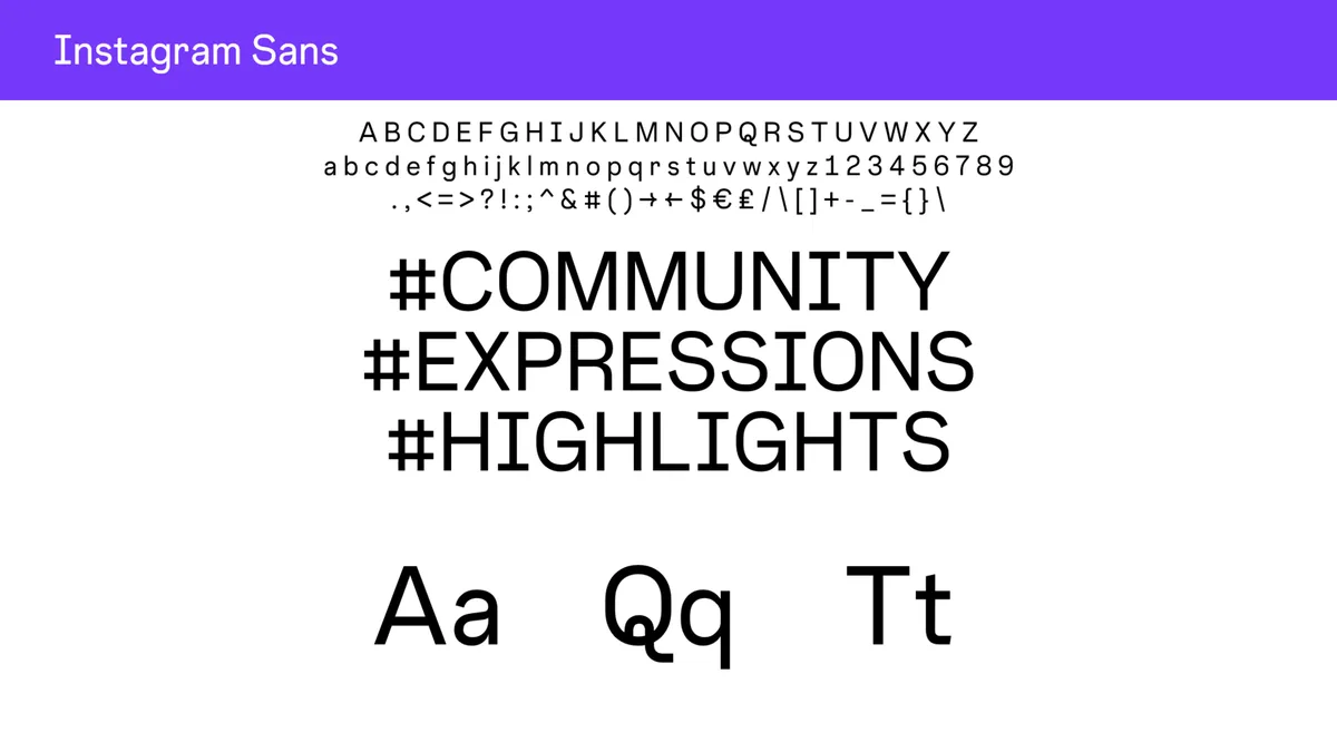
There is no hidden font menu inside Instagram. The styles the app itself offers live in the Stories text tool, and everything else people call an Instagram font is ordinary text written in look-alike Unicode characters. Knowing which is which is the difference between styling your posts and making them unreadable.
The look-alike trick works because of Unicode, the character encoding standard maintained by the Unicode Consortium to support text in all of the world's writing systems, according to Wikipedia's Unicode entry. Version 18.0 of the standard defines 172,808 characters and 175 scripts, per the same entry, and Unicode encodes the vast majority of text on the internet, including thousands of emoji. That catalogue is where the extra letters come from.
Where the app's own fonts live
The built-in styles are in the Stories text tool: open the camera, start a text box, and tap through the style options until the look changes. Those styles belong to the app, so they render the same for everyone who sees your story. The list is limited on purpose. It keeps text readable at small sizes and on every screen. Captions and bios are different. There is no style picker for either, which is exactly why people go looking for font generators.
How bio font generators actually work
A generator does not change your font. It swaps each letter for a different character that looks like a styled version of it, pulling from look-alike characters elsewhere in the Unicode catalogue. The result pastes into your bio because it is not formatting at all; it is new text that travels with the characters.
Unicode was never designed as a font system. The standard treats typefaces as an implementation choice, and any given character may have many allographs, from plain bold and italic letterforms to decorative styles, per Wikipedia's explanation. The look-alikes work everywhere precisely because they are characters, not styling. That is also why the same trick works in any app: the characters do not belong to Instagram. This connects to our earlier piece, How Instagram pinned posts work and which three to choose.
The trade-offs to know before you paste
Styled Unicode text has real costs. Screen readers may read the look-alike characters letter by letter or garble them, so a styled bio can say nothing at all to a blind follower. Search is another loss: a styled name will not match a plain-text search for your name.
Rendering is the third risk. Software that cannot process a Unicode character appropriately often shows an open rectangle in its place, according to Wikipedia's entry, and some devices lack the glyphs for the rarer look-alikes. Your stylish caption can arrive on half your audience's phones as empty boxes. None of this makes styled text bad. It just makes it a garnish.
How to use styled text well
Use styled text the way you would use a loud voice: briefly. A styled word in a caption or a highlighted line in a story can add character. Keep your name, your links, and any practical information in plain text, so they stay searchable, speakable, and readable everywhere. One more habit: read the styled line out loud. If it takes effort to say, it takes effort to read. Test the paste on a second device before you commit; if it shows boxes there, it will for part of your audience too. Readers following this should also see How to organize Instagram story Highlights that visitors actually use.
Conclusion: style is a garnish, not the meal
Instagram's own fonts live in Stories. Bio fonts are Unicode characters doing an impression of typography. Both can add polish, and both punish overuse: style a word, keep the substance plain, and your profile will read the way you meant it to.